Analyzing and Visualizing Netflix Stock Data
This project was done with the goal of creating a stock profile for Netflix using Python. A stock profile is a series of studies, visualizations, and analyses that dive into different aspects of a publicly-traded company’s data.
First Step: Importing and Cleaning the Data
After importing the libraries I needed to perform my analysis, I imported the stock data for Netflix (and its quarterly stock information) and The Dow Jones. I also changed the name of the Adj Close column to Price for easier reference.
Second Step: Visualizing Quarterly Data
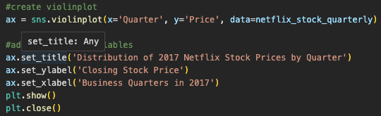
I wanted to get an understanding of the distribution of the Netflix quarterly stock prices for 2017. Specifically, to see in which quarter stock prices fluctuated the most. I used seaborn to create a violin plot, with one violin for each quarter.
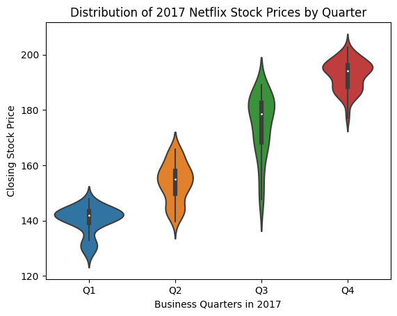
After looking at the visualized data, it seems that the median closing stock price is lower in Q1 than in the other Quarters. The shape of the distribution shows that the closing stock price is highly concentrated around and above the median.
While most of the prices fell within the Interquartile range for each quarter although there is still a decent amount of closing prices in the rest of the distribution outside of the interquartile range.
The highest and lowest prices of each quarter are as follows:
Excluding Outliers:
Q1: High = ~150 Low = ~135
Q2: High = ~165 Low = ~140
Q3: High = ~190 Low = ~145
Q4: High = ~205 Low = ~175
Including Outliers:
Q1: High = ~155 Low = ~125
Q2: High = ~170 Low = ~135
Q3: High = ~200 Low = ~137
Q4: High = ~210 Low = ~170
Third Step: Measuring Performance of EPS
The next step was to chart the performance of the earnings per share (EPS) by graphing the estimate Yahoo projected for the Quarter compared to the actual earnings for that quarters. I accomplished this by using a scatter plot.
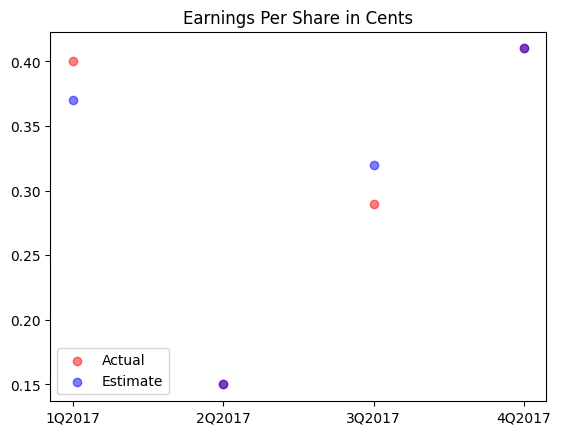
After creating the scatter plot, I was able to identify that Netflix beat its Estimate EPS in Q1, matched the estimate in Q2 and Q4, and struck lower than its estimate in Q3.
Fourth Step: Visualizing Earnings and Revenue
The next step was to visualize the earnings and revenue reported by Netflix by mapping two bars side-by-side using matplotlib.
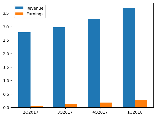
After looking at the visualizations, my first impressions were that the revenue and earnings followed the same upward trend as the quarters progressed. And that roughly 3% of the revenue constitutes earnings. An upward trend in both these sectors represent that Netflix had a good financial health in 2017.
Fifth Step: Comparing to the Dow Jones Industrial Average
The final step of creating the stock profile was to compare Netflix stock to the Dow Jones Industrial Average in 2017. I accomplished this by plotting two line charts side by side in one figure.
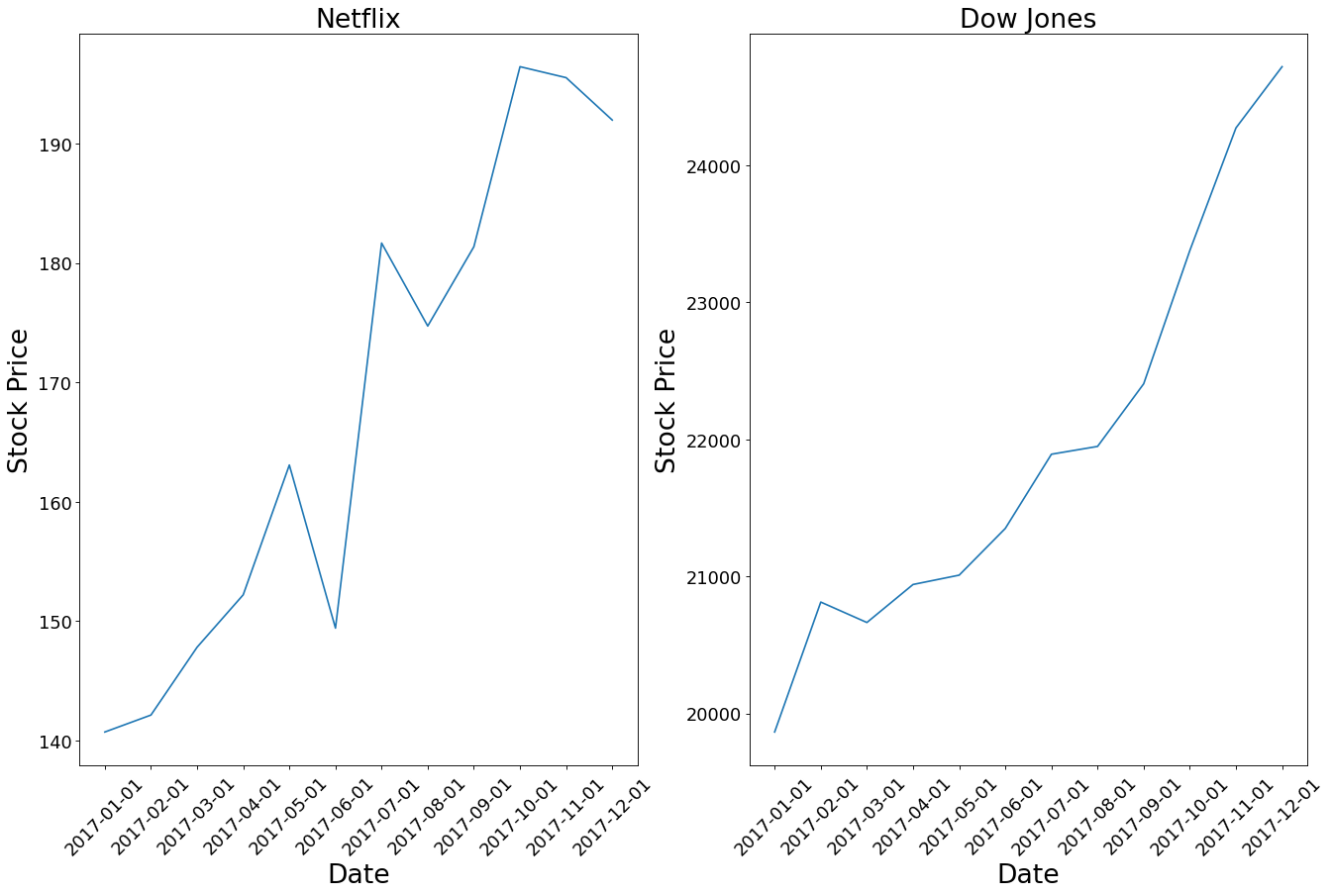
Relative to the Dow Jones Industrial Average, Netflix shares rose nearly 60% in 2017 compared to the 25% rise of the Dow Jones.
Netflix was more volatile experiencing two harsh downtrends in 2017 compared to the Dow Jones which increased steadily throughout 2017.